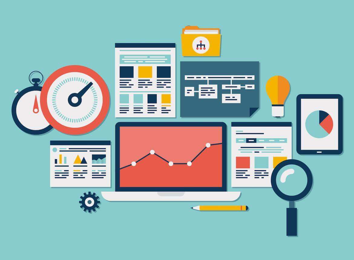
How often is it that a client comes in with a problem: “There is site traffic, positions in search engines, but no real customers. We don’t know what to do”. In these cases the problem must be found in the usability of the site. After all, there are sites where nothing is clear, you can not find the information you need or quickly find contacts, and sometimes the welcome speech of the head of the company is on the main page, and the user is interested in it almost in the last place. That is why they began gradually to educate employees and clients, and to develop the topic of usability.
Usability specialists
There is a natural lack of qualified usability specialists on the market right now, because it is a very young field. This leads to a multitude of low-quality sites. A quality usability specialist must have an analytical mind and a marketing education, because he/she is making a website not for the customer, but for the consumer. It is not necessary to have a technical background; it is enough to have a good understanding of people and their needs.
Usability testing
There are several ways to conduct usability testing. The easiest way is A/B testing which shows two different versions of a page to users and measures where the conversion from visitor to consumer is higher. Another way is to show the site to potential users and interview them about how everything is clear, comfortable and convenient, whether the interface makes them want to work with the site further. They are also given a task to perform a specific action on the site, and see how quickly and easily they cope with it.
Impress the user
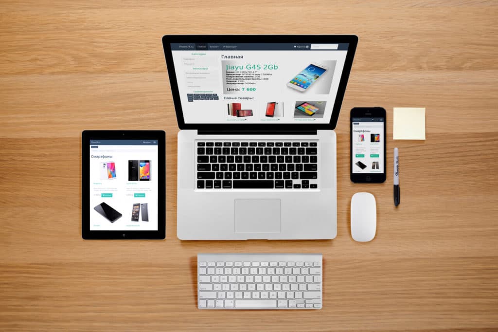
In order to impress the user, you first need to think about it and put yourself in the place of the user, using only what he understands. Now, to stand out with one design is almost unrealistic. You need to focus on ease of use, service, and quality of service. For example, the online store has a convenient and well thought-out design, although it is not creative, not and overflows with all the colors of the rainbow – it is simple and understandable. And the various flash-animations have to die because they do not work well with search engines, they are not displayed on mobile devices and are inconvenient to use. Pop-ups and flashing banners also discourage visitors.
The website of the future and the conversion effect
It is very real that in 3-5 years, the site will be tailored to the man based on user data. It will be able to automatically change the resolution depending on the monitor, it will also be possible to adjust the size of the screen, the user’s previous history, and offer exactly what the user needs. The site will be individualized for the visitor. All with the goal of maximizing conversions. For example, conversion on Amazon is about 30-40%. This is what you have to focus on. Working on usability, you can achieve very high rates. And of course, the cost of usability will pay off. Sometimes you only need to remove the non-working elements, and the conversion rate will immediately increase.