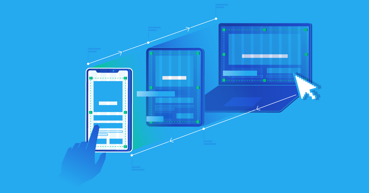
In the modern world, it is easy to imagine a multicooker that has access to the Internet and can be controlled using any mobile gadget. But is it so easy to go to the site from the phone so that everything is clearly visible and the buttons are not mistaken? In most cases – yes, but sometimes, you understand that it is better to search more than to try to understand something in the small print of the found page. That is why there is a responsive website design that has the ability to adapt automatically to different screen resolutions, to be displayed correctly on any mobile device, as well as to be seen and understood when used on all gadgets.
In the right company, you will definitely be asked if you need a responsive design. It is worth ordering it, because every year the number of network users using phones, tablets and Irod is only growing, which means that the number of your visitors is also increasing. And if your site is inconvenient to use from different devices, it will automatically lose its attractiveness to customers.
Why do you need a responsive design for your website?
There are several reasons for this:
- The number of devices from which Internet visitors access the network is growing every year. They all have different screens and their ability to display information is also different. If the site has a responsive design, then any user will be able to adequately see all the content. And if not, then the blocks usually float and all elements are displayed incorrectly.
- If you have a responsive design, then you have a guarantee that the Internet traffic to your site will be increased due to users of mobile gadgets. Their number is growing every year and sometimes makes up to 50-60% of all traffic to the site. Therefore, you will only benefit from such a decision.
- You can keep up to date with all the affairs of your regular visitors around the clock. If your project involves feedback from customers, new products, discounts and promotions, then visiting your pages at any time from a phone, tablet or iPad, they will be able to find out everything immediately.
Do not confuse responsive design with the mobile version of the site. The mobile version is an application that is created additionally and has a number of disadvantages: it needs to be downloaded to the device, site materials need to be integrated, traffic is divided, and each operating system has its own peculiarities of displaying your application. Adaptive design, in turn, is one site name and the same content.